 EN
EN  DE
DE 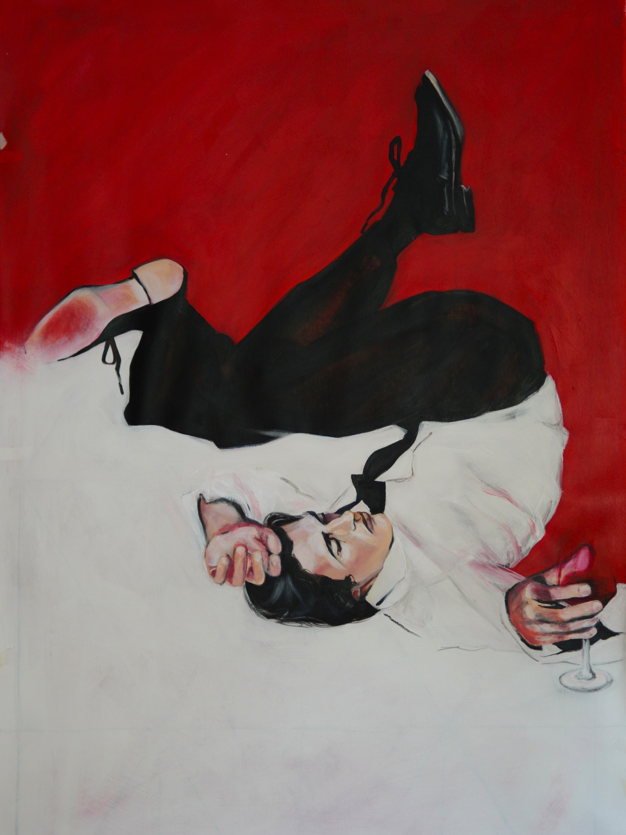
Color is not just visual. It is physiological. Before we interpret form or meaning, we feel color. It reaches the brain instantly, influencing mood, energy, and perception. Its power lies in its ability to transform depending on context.
Different colors trigger different neurological responses. Warm tones stimulate energy and movement, while cool tones calm and stabilize. In design, this becomes a powerful tool to guide behavior and influence emotion without words.
"Color is the most relative medium in art."
— JOSEF ALBERS
FOREVER YOUNG by Tatiana Lazareva, 2024, 100x140cm
Intentionality Over Decoration
The use of color today is more intentional and less decorative. We see strategic accents instead of full palettes, deep complex tones rather than bright saturation, and emotional color choices over trend-driven ones.
Designers are no longer asking what looks good, but what feels right. High contrast colors are used to increase alertness, while muted palettes are employed to reduce cognitive load in a world already saturated with information.
Color as Identity
Color has become a form of personal and brand identity. A space or object is remembered not just by its shape, but by its emotional tone. Color defines that tone, shaping the psychological perception of stability or vitality.
"Colors are the smiles of nature."
— YVES SAINT LAURENT
In contemporary design, colors are the primary language of emotion. By curating the chromatic environment, we don't just decorate a space—we design the experience of the individual within it.