 EN
EN  DE
DE 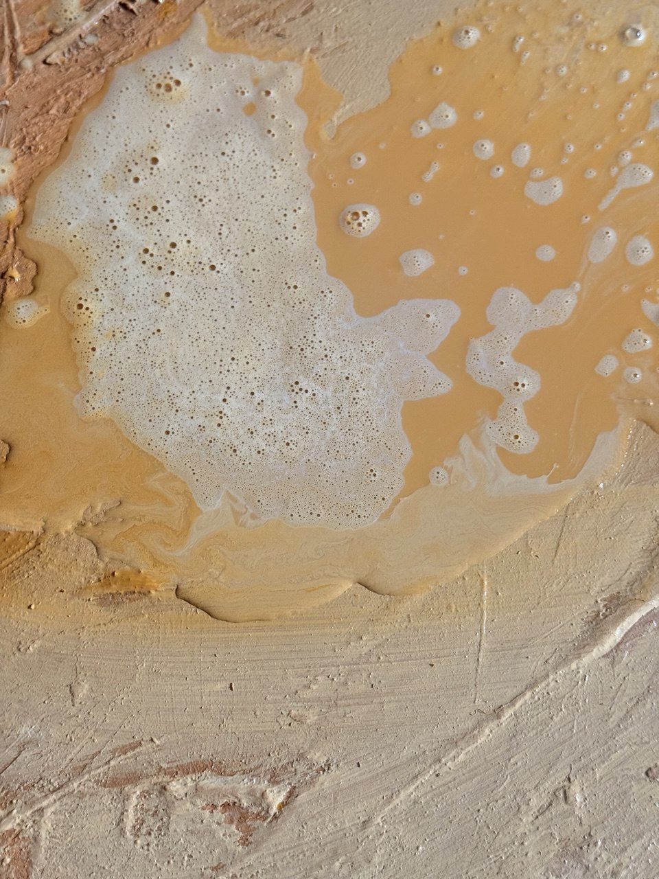
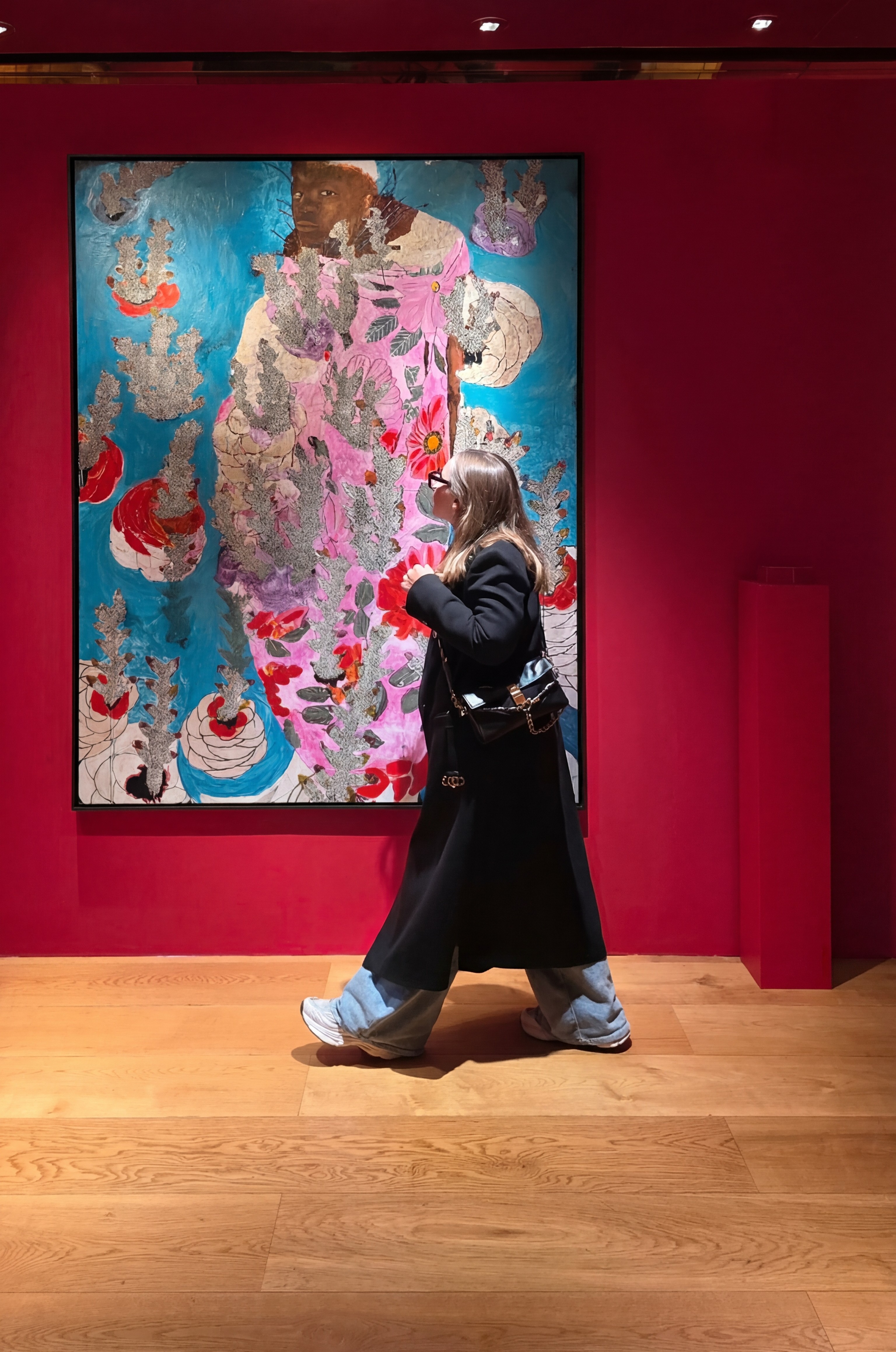
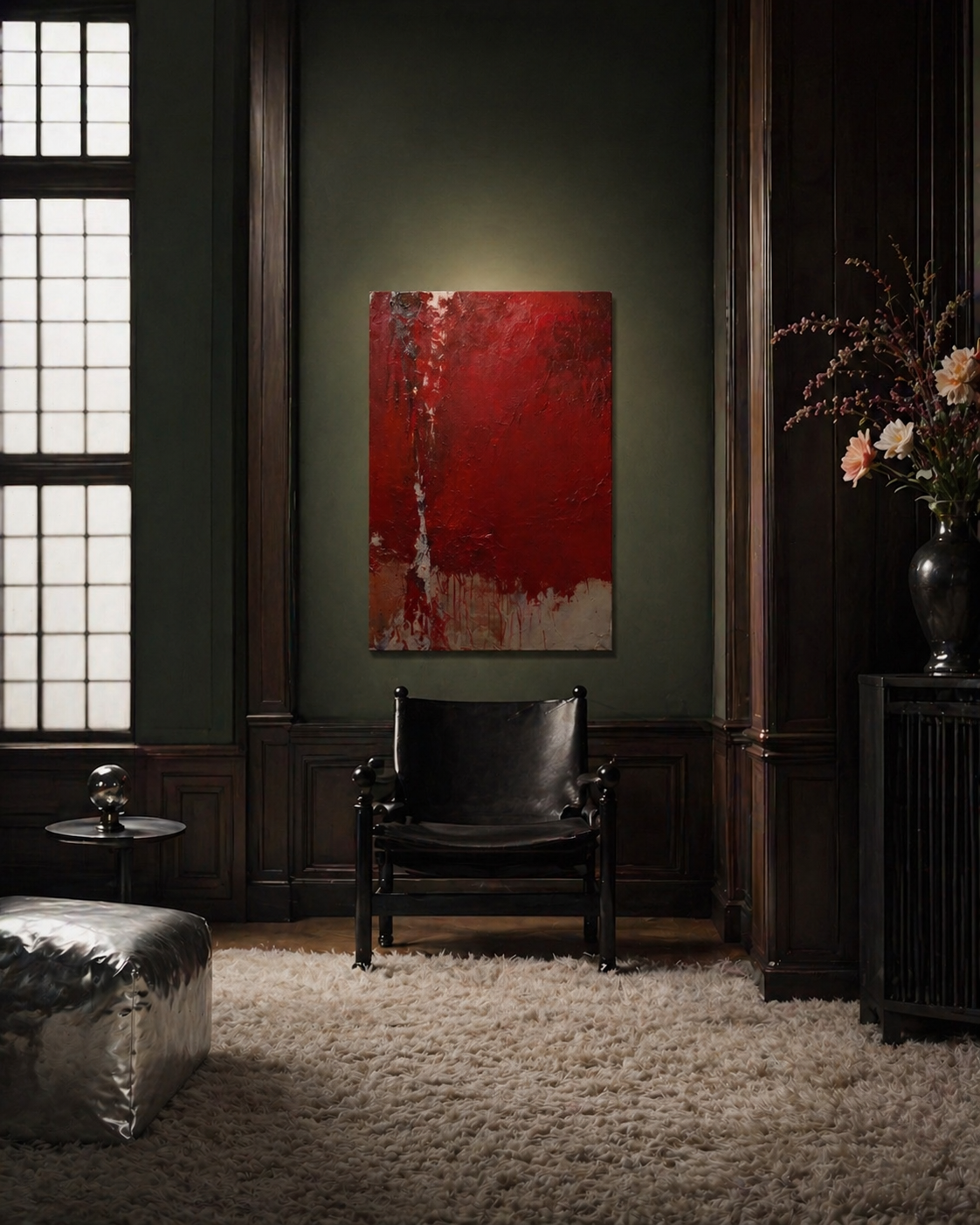
When we look at a rough, heavily impasted surface the brain does not simply register colour and form. Mirror neuron circuits linked to the somatosensory cortex activate, simulating the sensation of actually running a finger across the surface.
This is a cross-modal phenomenon: the visual system and the tactile system share neural real estate, and the boundary between seeing and touching is far more permeable than common sense suggests.
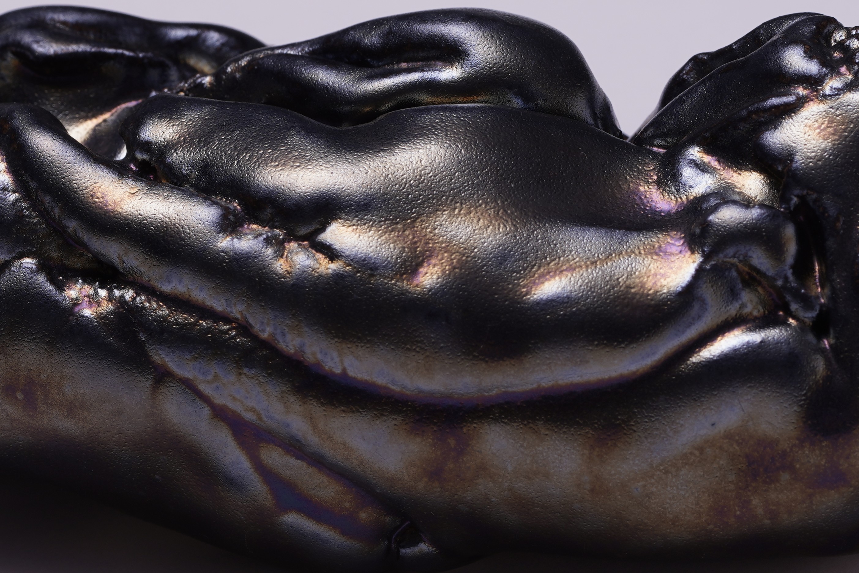
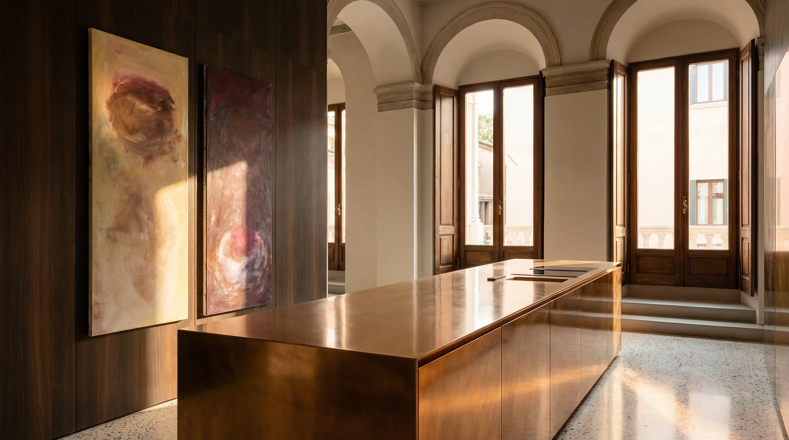
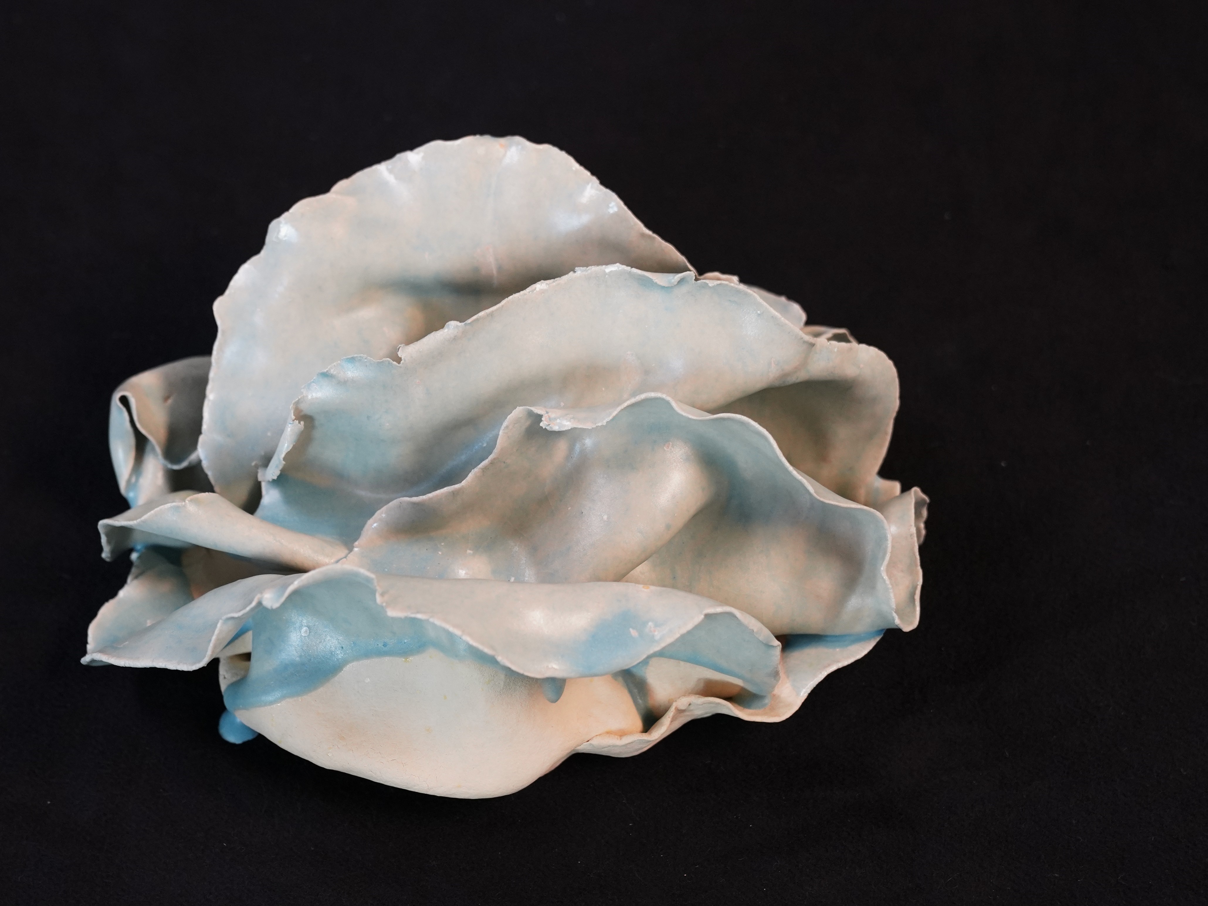
Ceramics in classical interiors occupy a unique position, as they bring together utility and artistic tradition. Unlike decorative elements that shift with changing trends, ceramics have long been associated with enduring values of form, craftsmanship, and material. Their presence in a classical space is always tied to the idea of time, cultural memory, and a tactile experience that cannot be replaced by artificial substitutes.
In classical interiors, ceramics appear through both architectural elements and objects of applied art. These may include fireplace cladding, tiles, ceramic panels, vases, or sculptural pieces. What is essential is that ceramics are not treated as isolated accents but are integrated into the structure of the space, becoming an organic part of it.
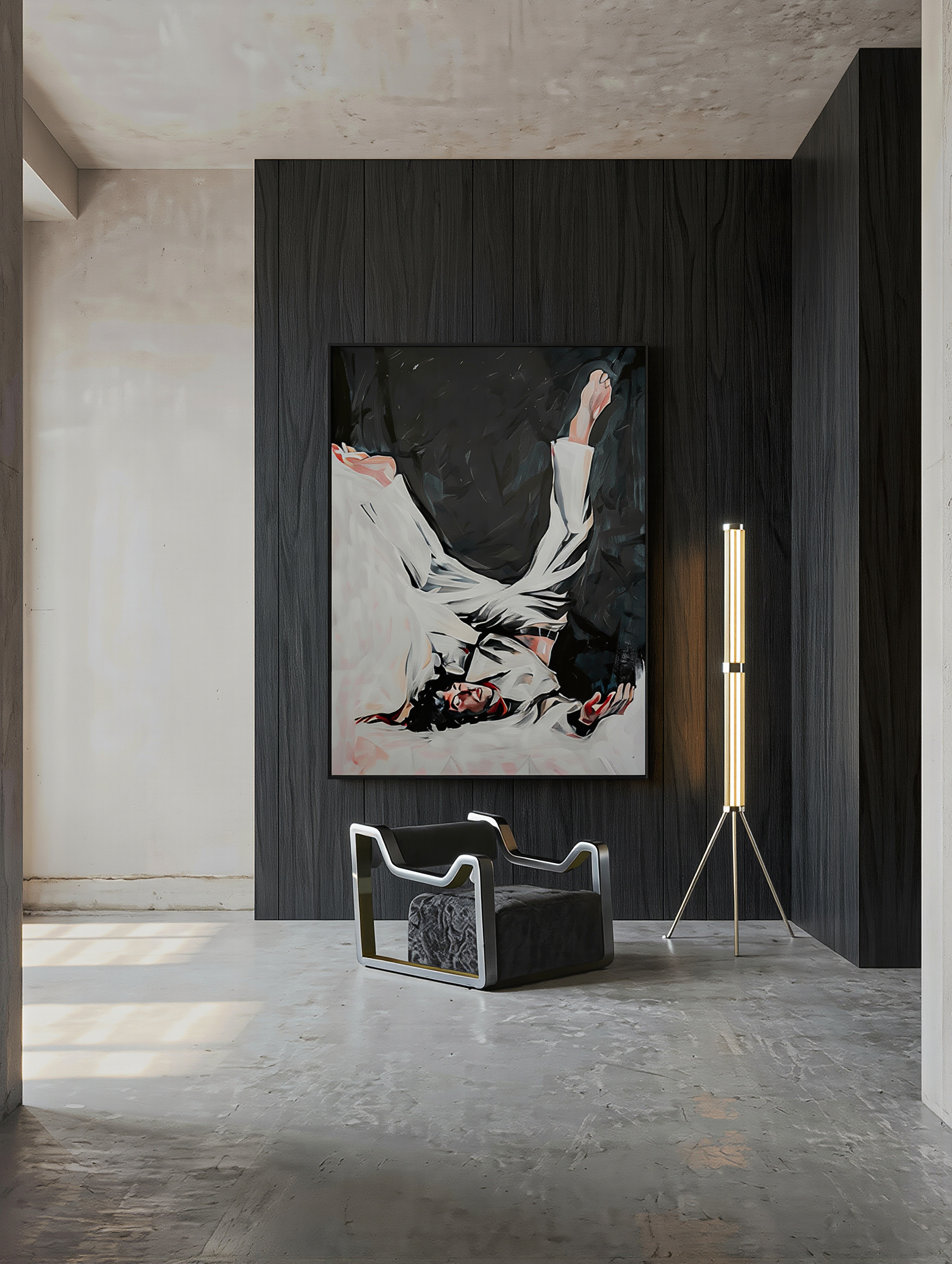
Brutalism in art emerged as a response to the cultural and physical rupture that followed the World War II. Artists of that time no longer trusted classical notions of beauty and harmony, as reality had become too harsh to be adorned. The term itself is connected to the concept of béton brut, introduced by Le Corbusier, meaning “raw concrete,” a material that does not conceal its nature.
In art, this led to a rejection of decoration and a search for direct, honest expression. Material ceased to be a neutral carrier of form and became part of the meaning itself. Artists employed rough textures, cracks, traces of damage, and industrial substances. Works often appear unfinished, yet this is a deliberate gesture in which the illusion of perfection is replaced by the presence of reality.
Minimalism is no longer a style. It has become a language of perception, a philosophy of attention, and increasingly, a form of quiet power.
In 2026, we are not witnessing its disappearance but its evolution. In a world saturated with images, noise, and constant stimulation, minimalism offers something rare: clarity, space, and emotional precision.
Read more: The Intelligence of Silence: Minimalism in Art and Design
What defines minimalism now is not strictness, but sensitivity.
Recent design presentations this year reveal a clear shift. The sterile, almost clinical minimalism of the past is giving way to something warmer, more tactile, more alive. We see the emergence of what could be described as “emotional minimalism.”
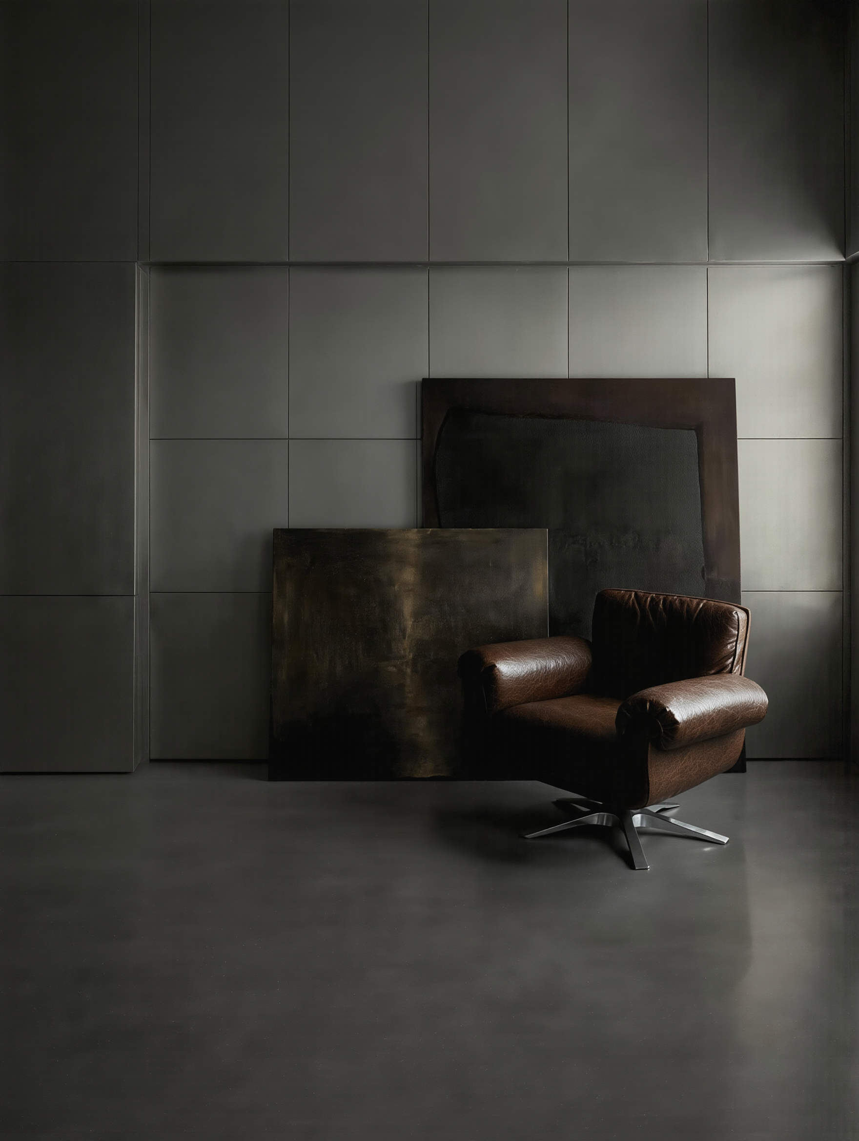
Minimalism and contrast may seem like opposites. One reduces, the other intensifies. Yet together, they form one of the most sophisticated visual languages in contemporary design. Minimalism creates the stage. Contrast delivers the moment.
In a minimal environment, every contrast becomes amplified. A single dark line on a white surface, a warm tone in a neutral palette, a textured object in an otherwise smooth space. These gestures carry more weight because nothing competes with them.
In minimalism, contrast often creates that interest. It is the friction that prevents silence from becoming stagnation.
Read more: Minimalism and Contrast: A Dialogue of Silence and Energy
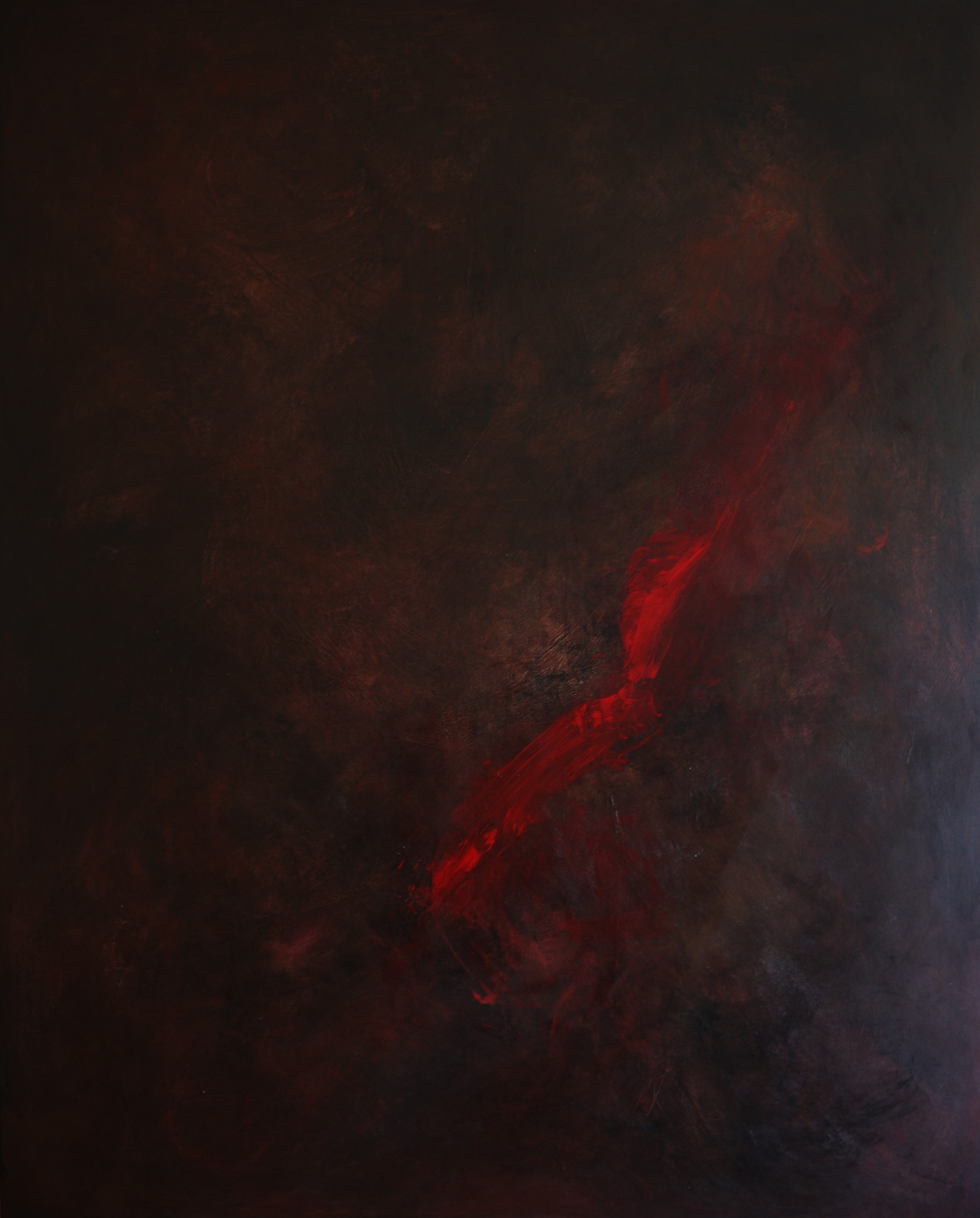
Color is not just visual. It is physiological. Before we interpret form or meaning, we feel color. It reaches the brain instantly, influencing mood, energy, and perception. Its power lies in its ability to transform depending on context.
Different colors trigger different neurological responses. Warm tones stimulate energy and movement, while cool tones calm and stabilize. In design, this becomes a powerful tool to guide behavior and influence emotion without words.
The Foundation of Visual Language
Lines are the foundation of all visual language. Before color, before material, there is line. It defines form, direction, and rhythm. This movement is what gives life to composition, transforming a static object into a narrative of space.
Lines guide the eye and influence how we experience space. Horizontal lines create calm and stability, while vertical lines suggest strength. Diagonal lines introduce tension, and curves evoke fluidity. In furniture and design, these principles become physical choreography.
Read more: Lines in Art, Furniture, and Design: The Architecture of Movement
When we look at a rough, heavily impasted surface the brain does not simply register colour and form. Mirror neuron circuits linked to the somatosensory cortex activate, simulating the sensation of actually running a finger across the surface.
This is a cross-modal phenomenon: the visual system and the tactile system share neural real estate, and the boundary between seeing and touching is far more permeable than common sense suggests. This is why a Rembrandt glazed in transparent oils can feel silky at a distance, while a Lucian Freud feels almost uncomfortably raw.
Read more: Touch without Touching: How Visual Texture Activates the Body
The line between art and design has dissolved into a single continuum. What we sit on, what lights our rooms, what defines our walls, these are no longer merely functional choices. They are positions in a cultural conversation.
Furniture behaves like sculpture. Lighting resembles jewellery. Interiors are conceived as curated installations rather than functional arrangements. This is the culmination of a philosophical argument that has been building for over a century, arriving now at a moment when boundaries have become essentially meaningless.
Read more: Design as Art: The Rise of Collectible Environments
Page 1 of 3